Luleå Business Awards
Website Redesign
Overview
Luleå Business Awards is an annual gala celebrating companies that contribute to the community in and around Luleå. The existing website felt outdated, visually flat, and hard to navigate — and gave visitors little sense of what the event actually looked, felt, or functioned like.
The Brief
Redesign the website to match the organisation's new graphic profile, make it feel modern and inviting, and clarify the structure of the awards.
The Challenges I Identified
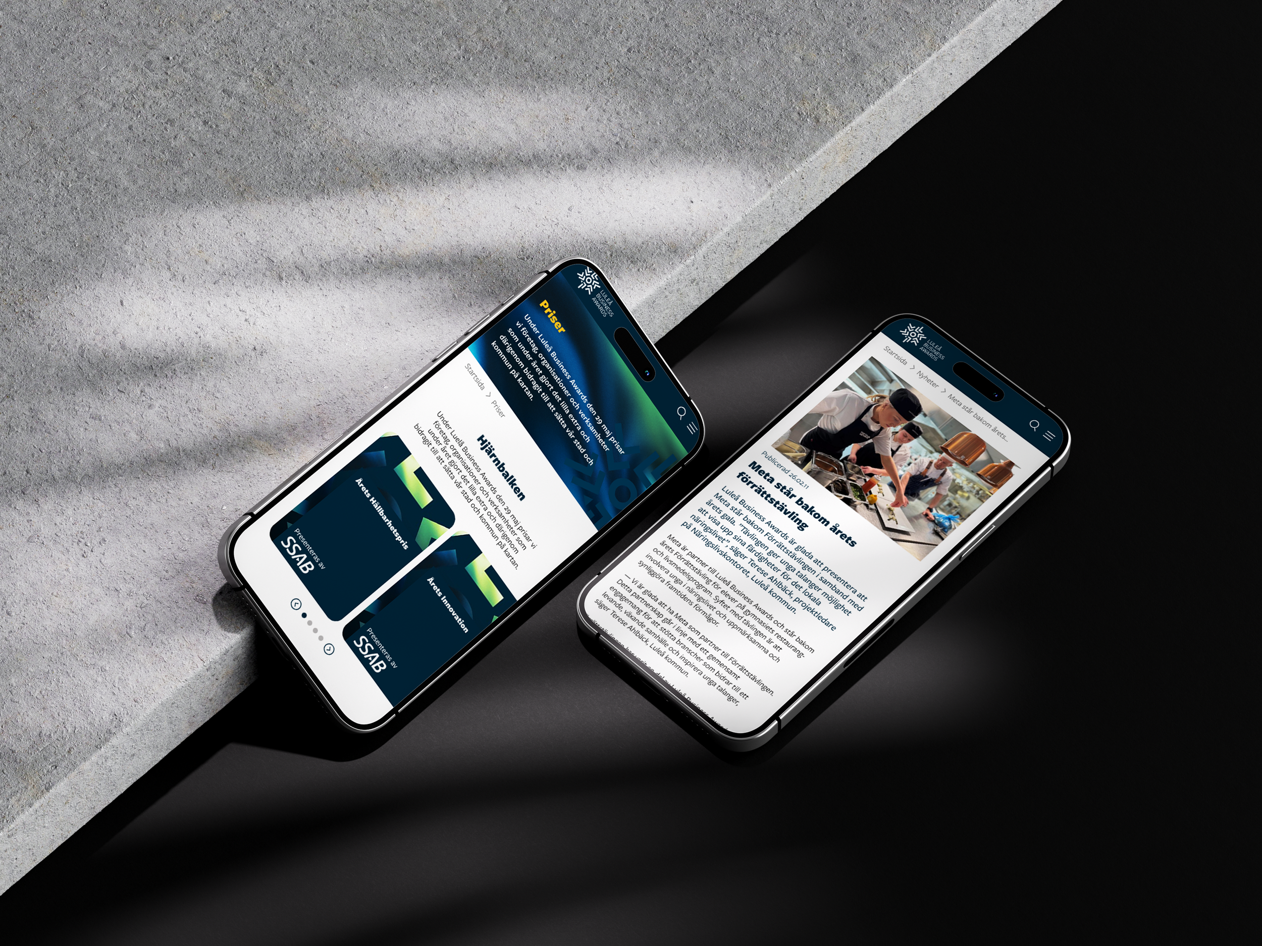
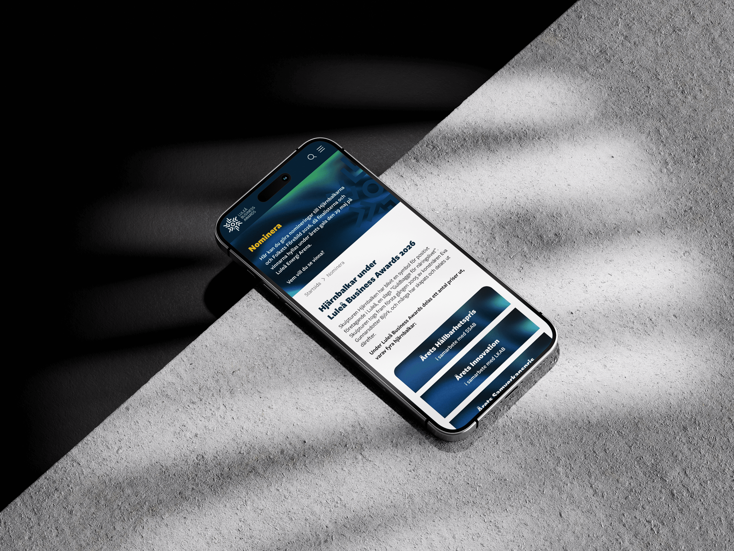
The different awards were hard to distinguish from one another — visitors couldn't easily tell which prizes belonged to the main organisers and which were sponsored awards
Previous winners were displayed in a spreadsheet-like format with no visual appeal
Sponsors had little to no proper visibility on the site — a problem both for existing sponsors and for attracting new ones
Much of the content was embedded as PNG images, making it static and hard to update
The overall look gave no impression of the gala's scale, professionalism, or atmosphere
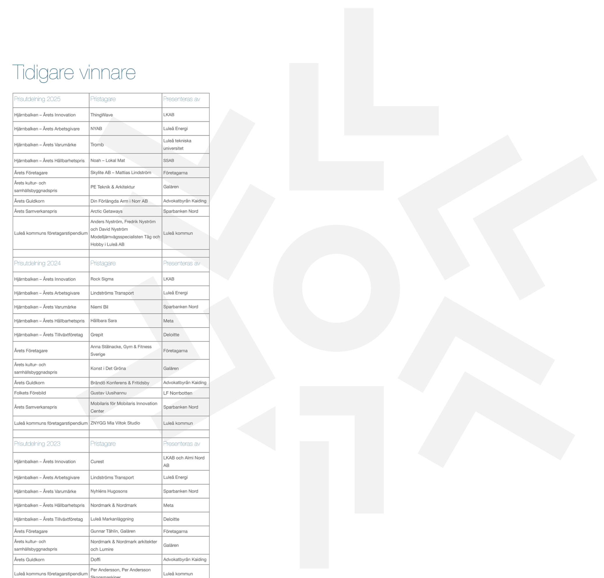
Old website design - how the previous winners were displayed
My Approach
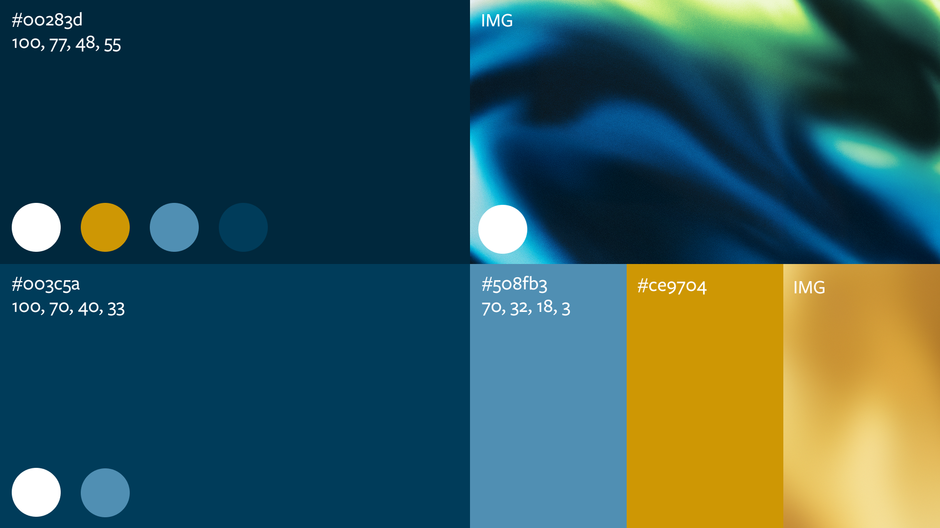
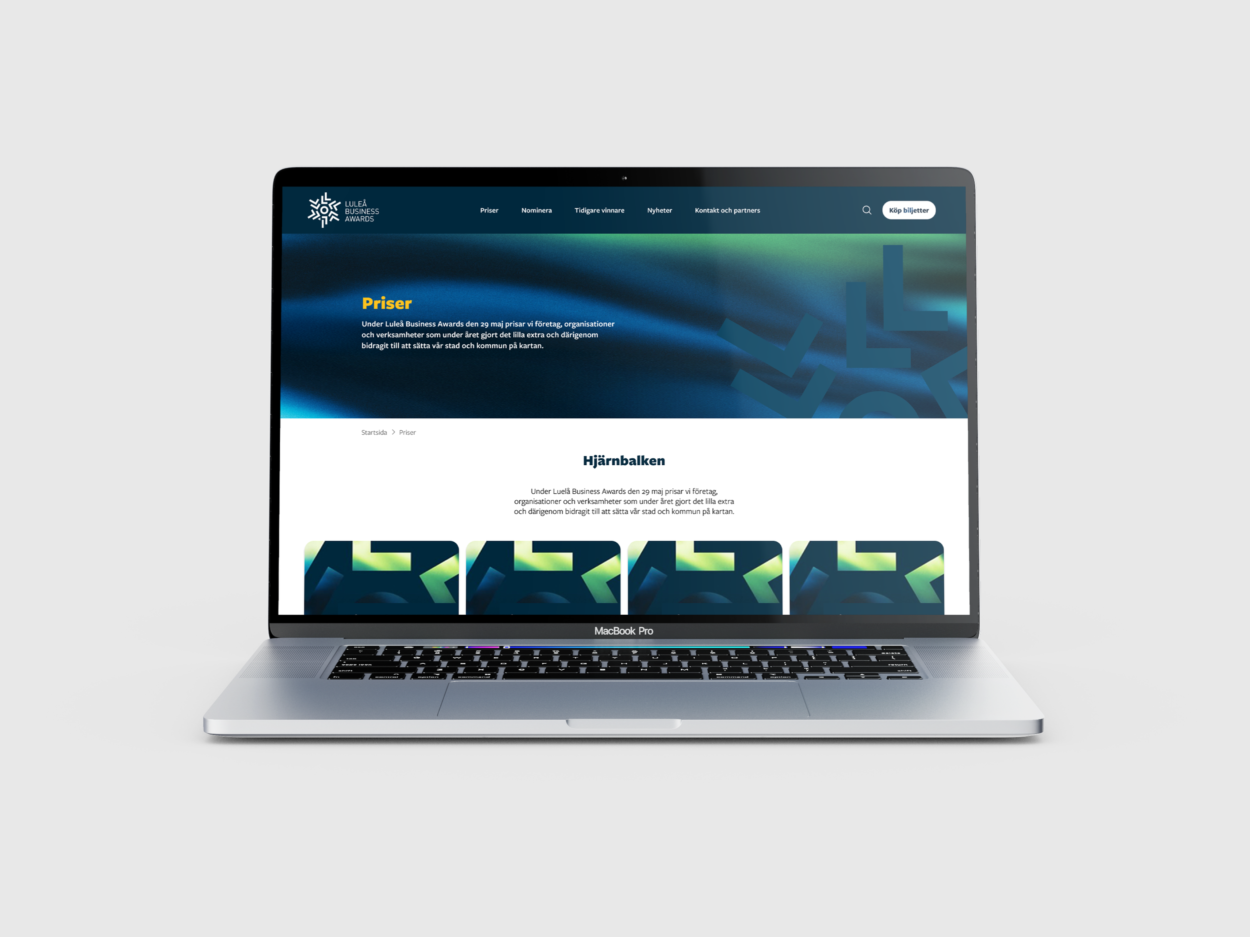
I started by adapting the brand's graphic profile — originally designed for print — into a digital context. The brand itself is fairly clean: dark navy as the base, gold as an accent, and a green gradient reminiscent of the northern lights. I used colour intentionally to distinguish between award categories and create a clear visual hierarchy.
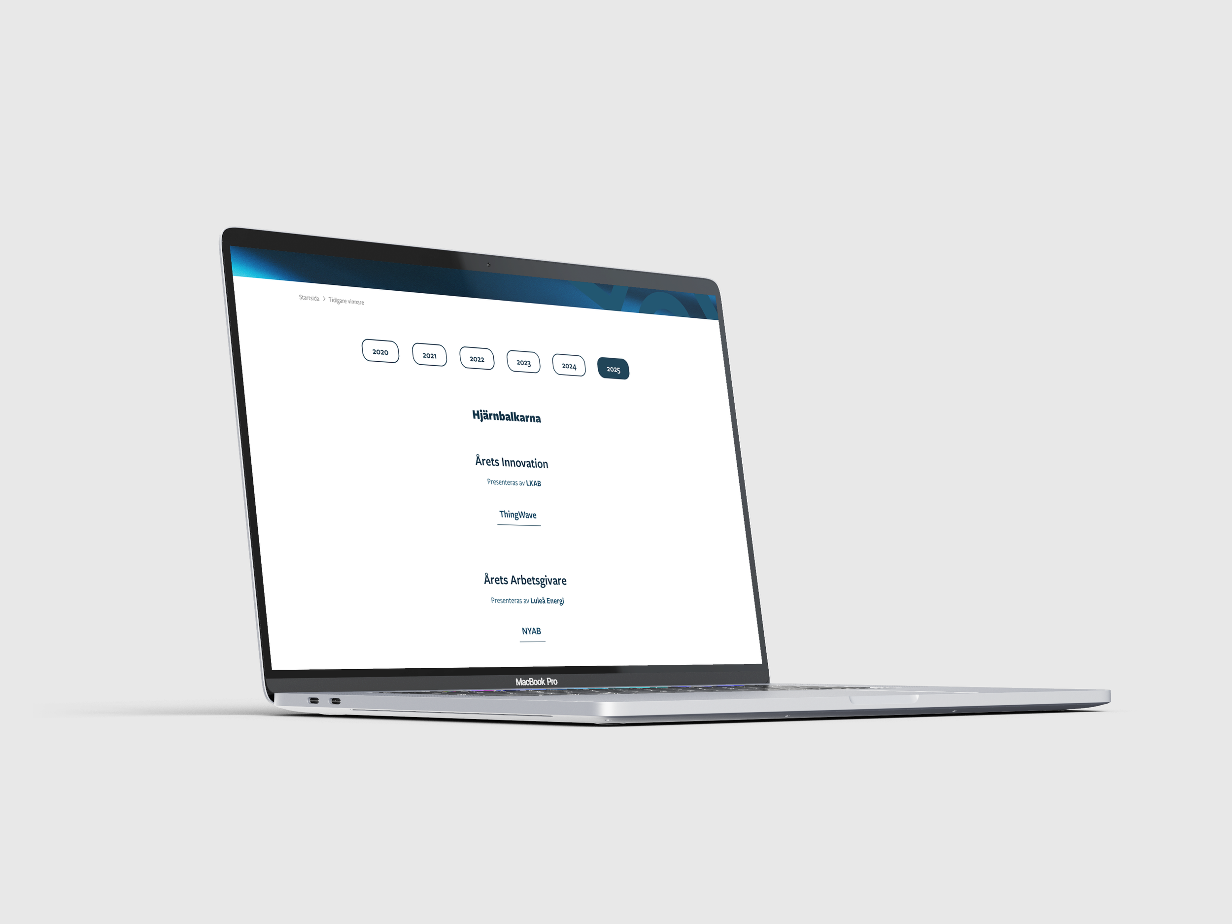
From there, I focused on clarity and experience. I redesigned the awards section so each prize has its own space, with a clear explanation of what it is and how it differs from the others. For previous winners, I created a more diploma-style presentation with a filtering function — letting visitors browse by year with a single click.
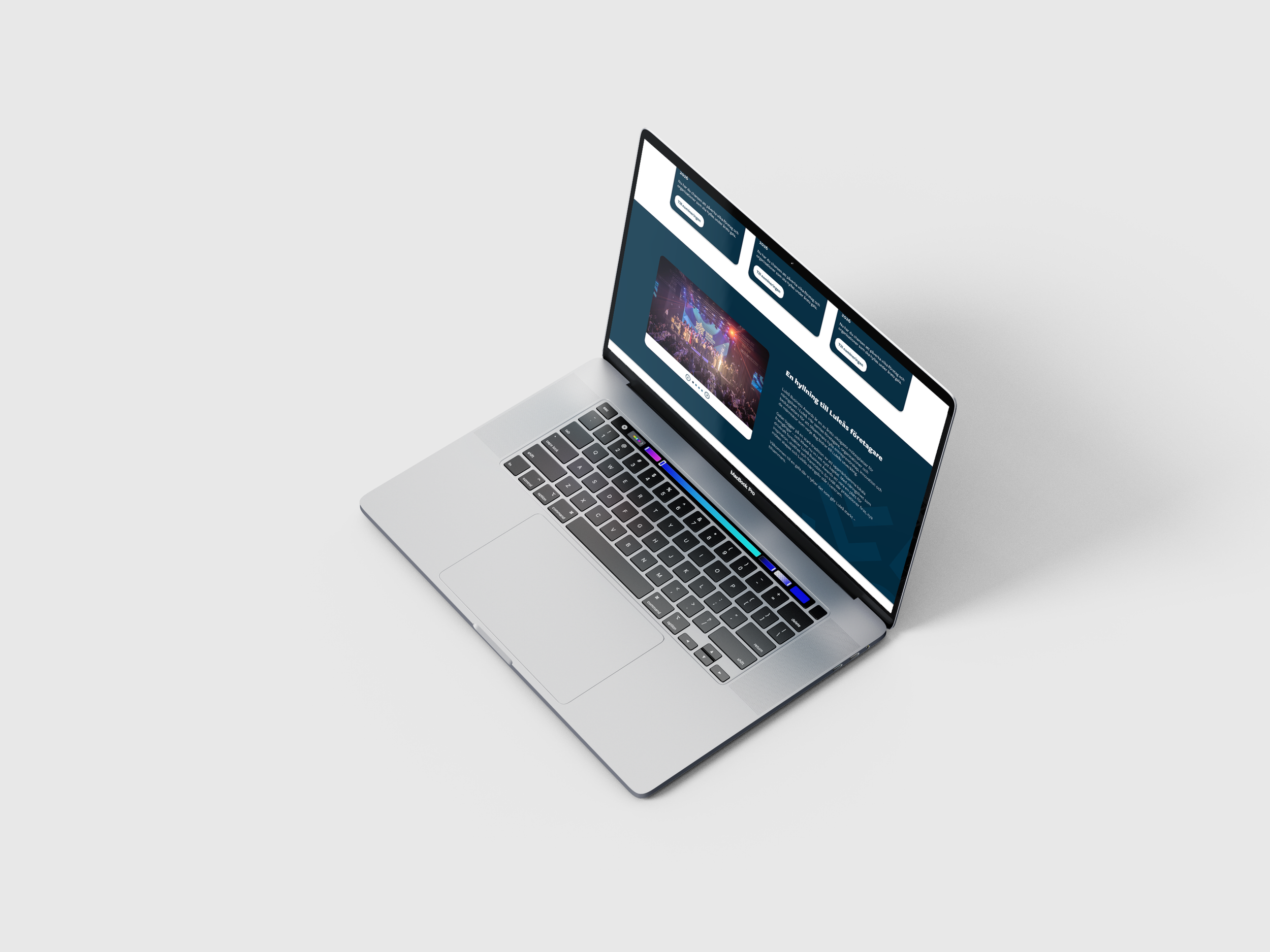
To bring the gala to life, I added a showreel from the previous year's event and a photo gallery. The goal was to give first-time visitors a real sense of the atmosphere — how large the event is, how much care goes into it, and how professional it feels.
Sponsors got proper, dedicated space on the site — both as a fair return on their investment and as an incentive for future sponsors to come on board.
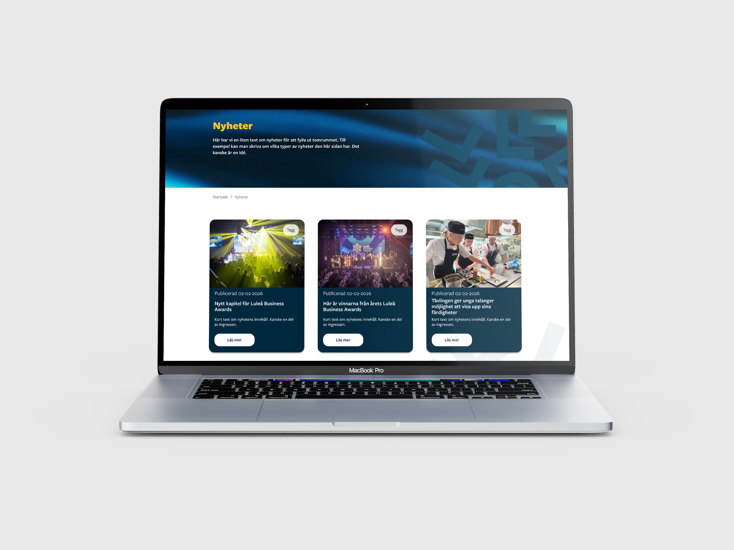
Finally, I redesigned the news section and its associated pages to create a more cohesive overall experience.
The Result
A website that feels as polished as the gala itself — clear, warm, and worth attending.