
Heyhabit - Rebranding & Redesign
As part of our thesis project, we took the opportunity to do something we hadn't had the chance to do before: create an entirely new visual identity for Heyhabit. While the product itself remains an ongoing project, this work allowed us to explore how the app and brand could evolve visually beyond the existing MVP.

Background
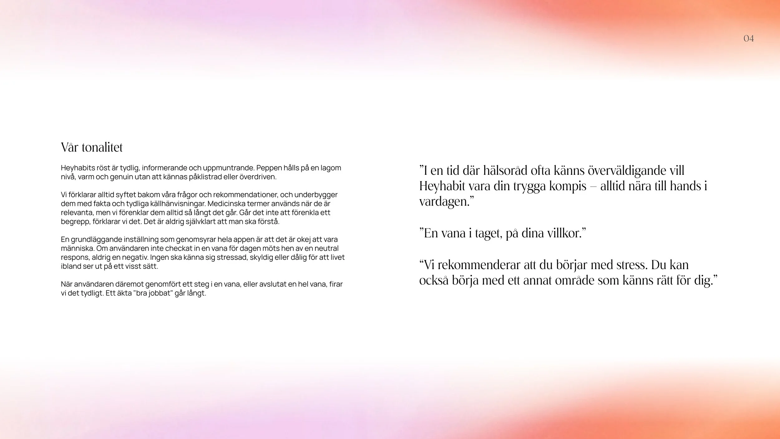
Heyhabit's existing brand identity had been created before we joined the project and needed adjustments to meet accessibility requirements. It also felt slightly too soft and clinical for an app designed to inspire lifestyle change. We wanted to take the brand in a new direction: more modern, more playful, and with a bit more edge, while still maintaining its medical credibility.
The New Brand Book
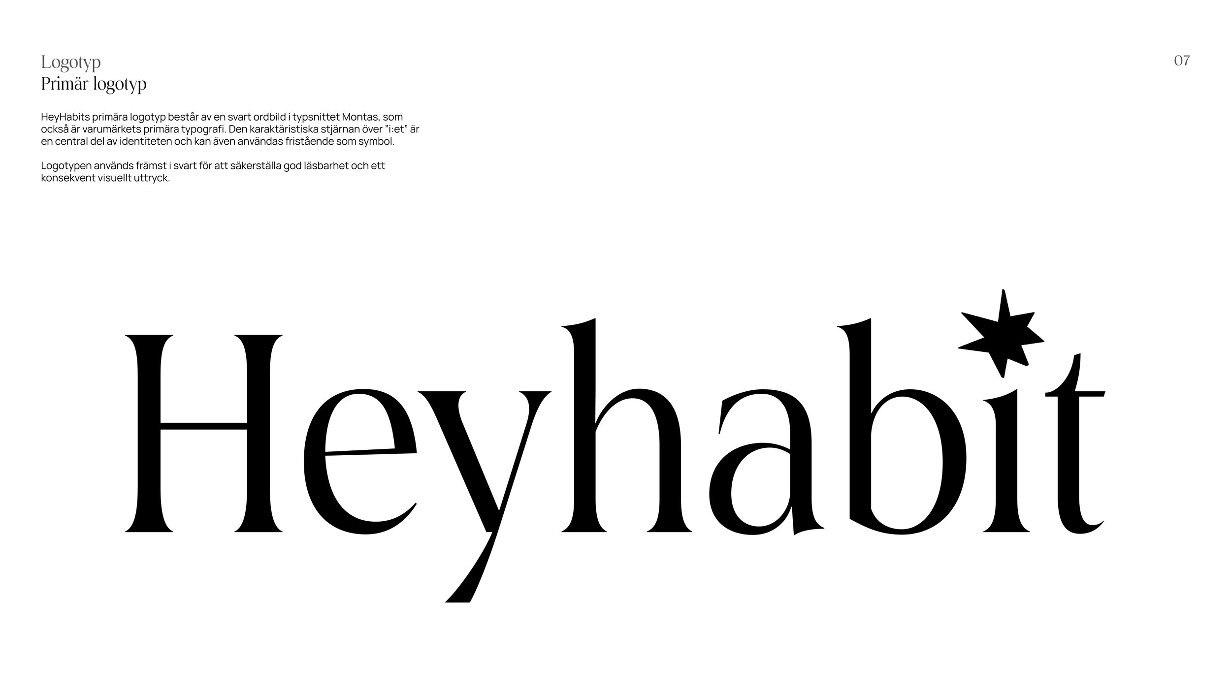
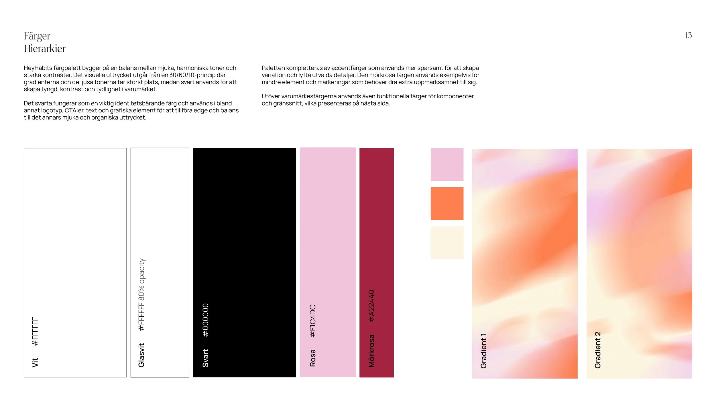
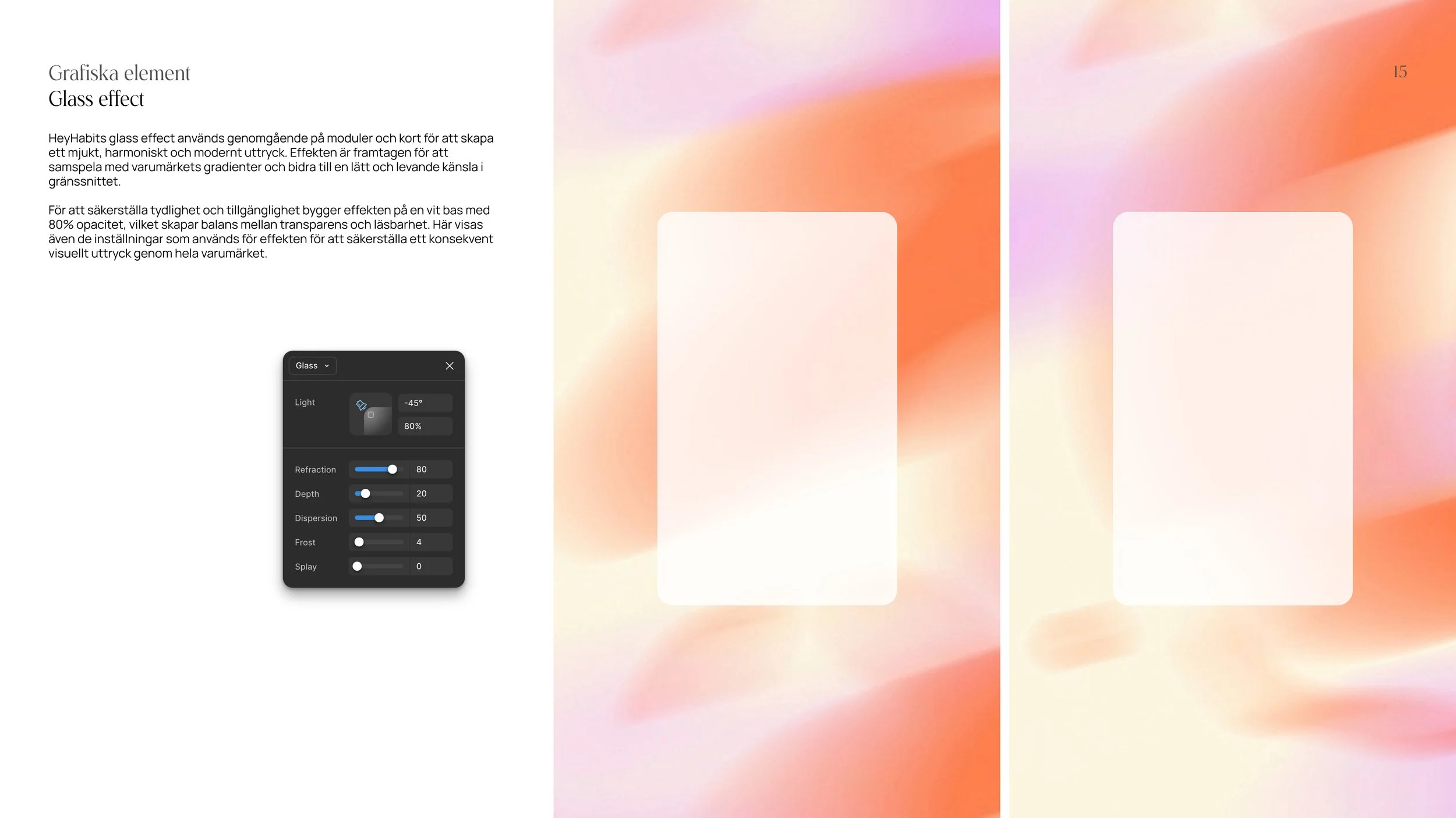
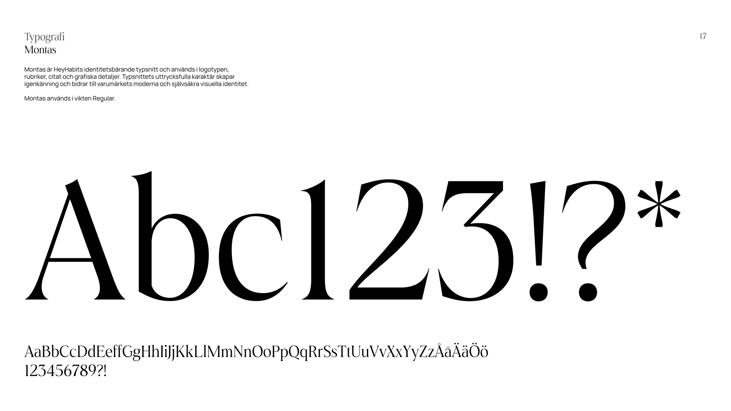
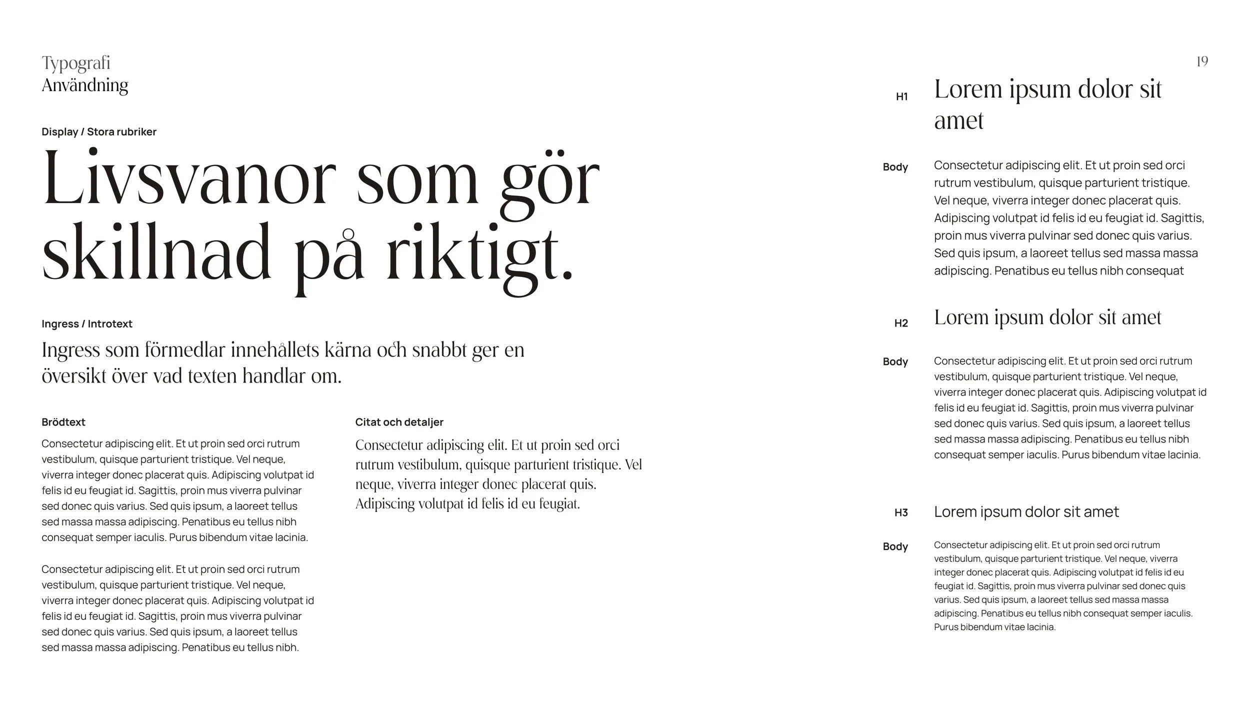
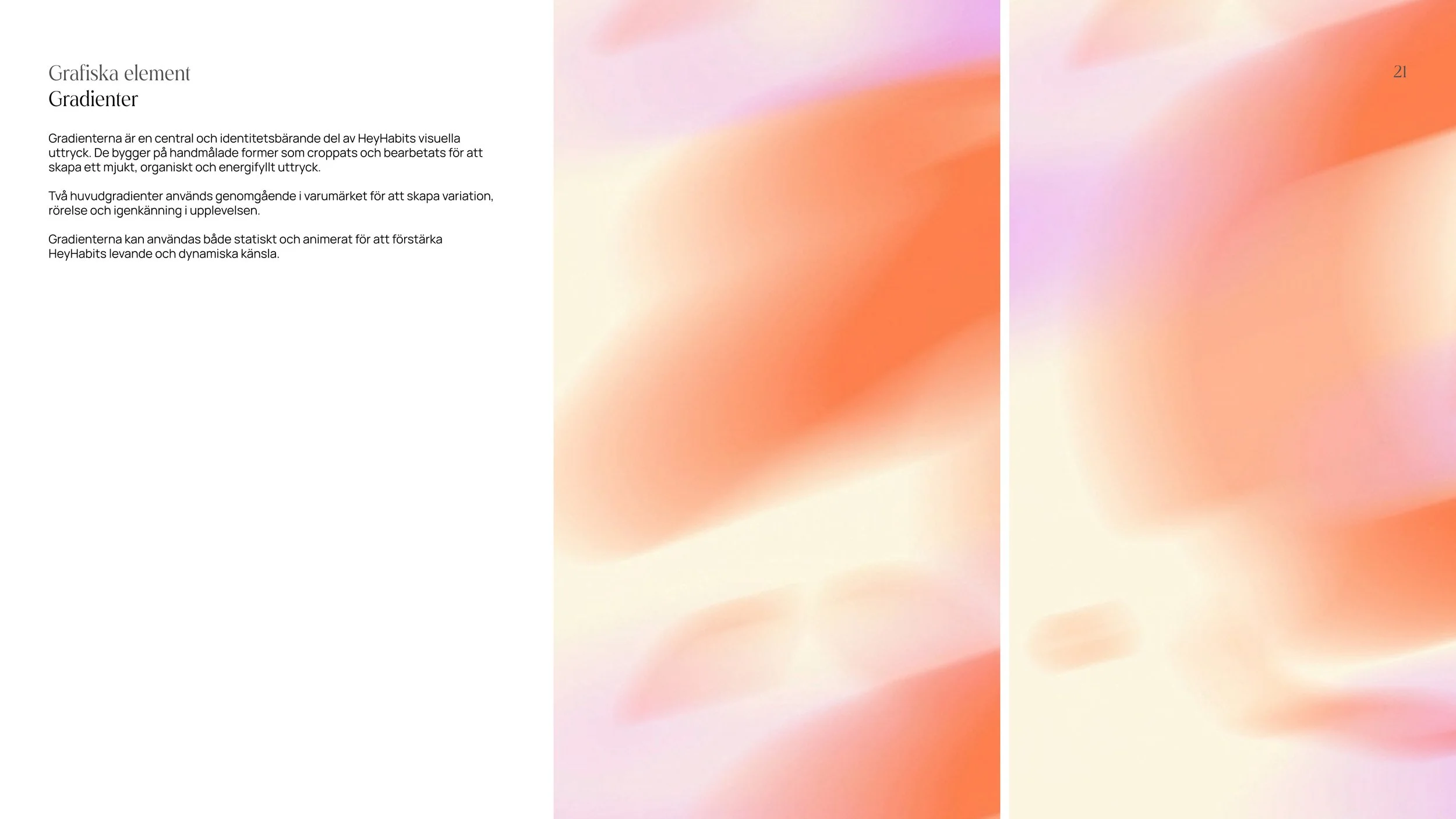
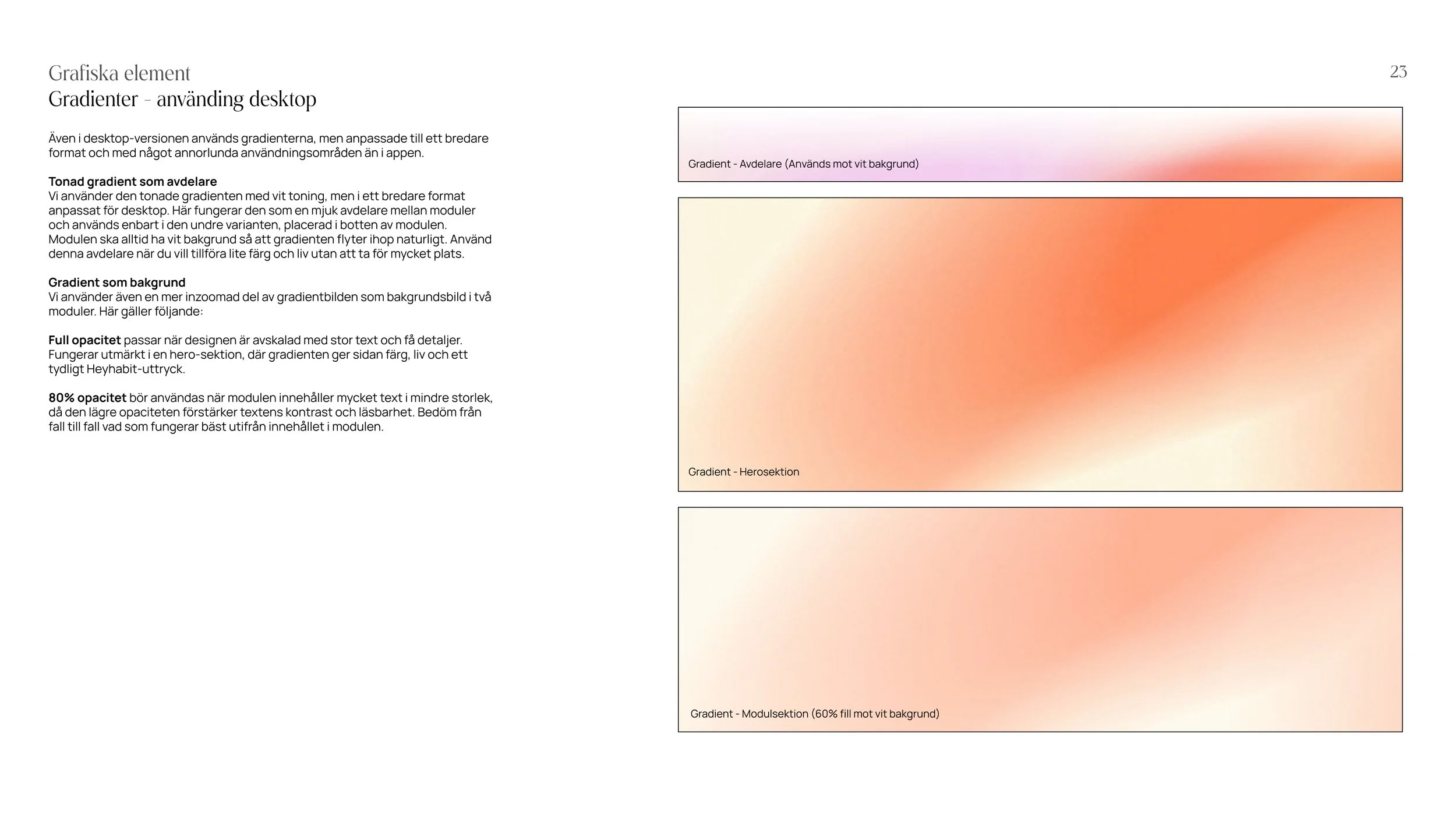
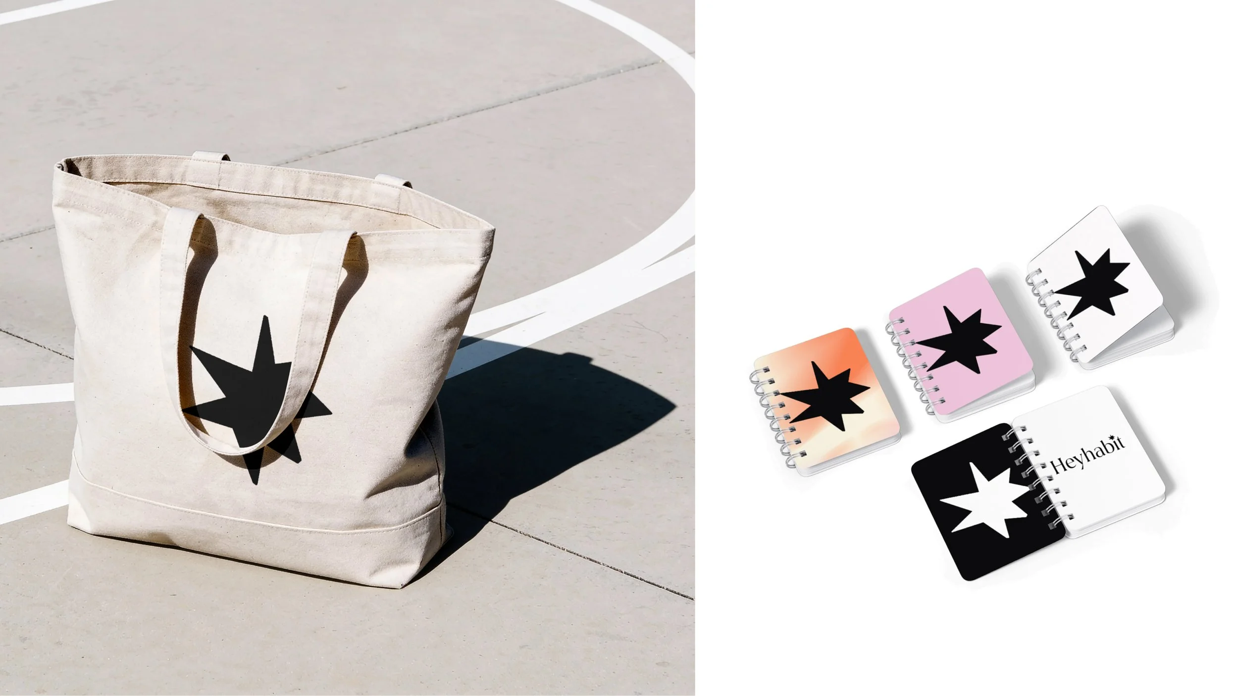
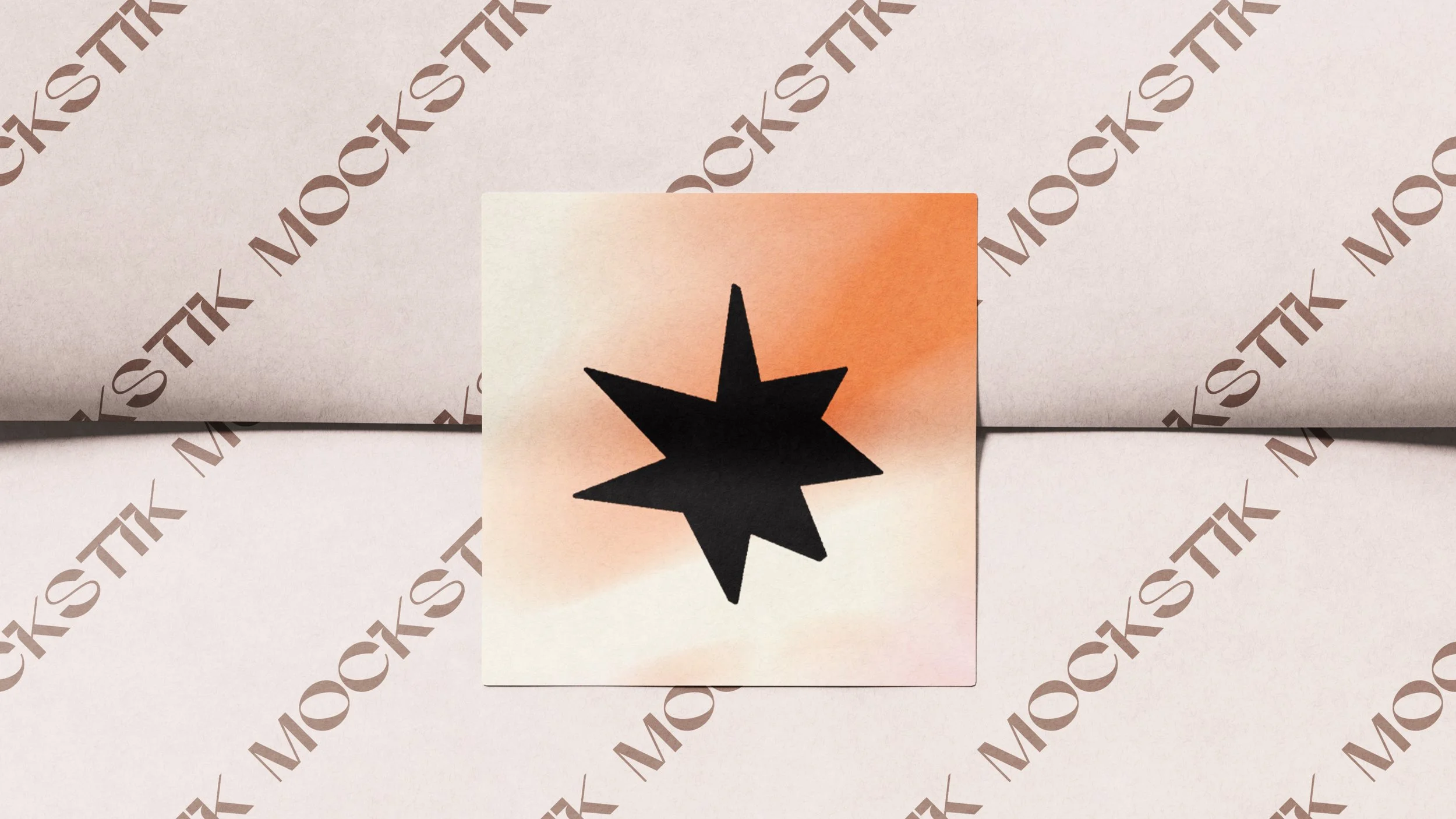
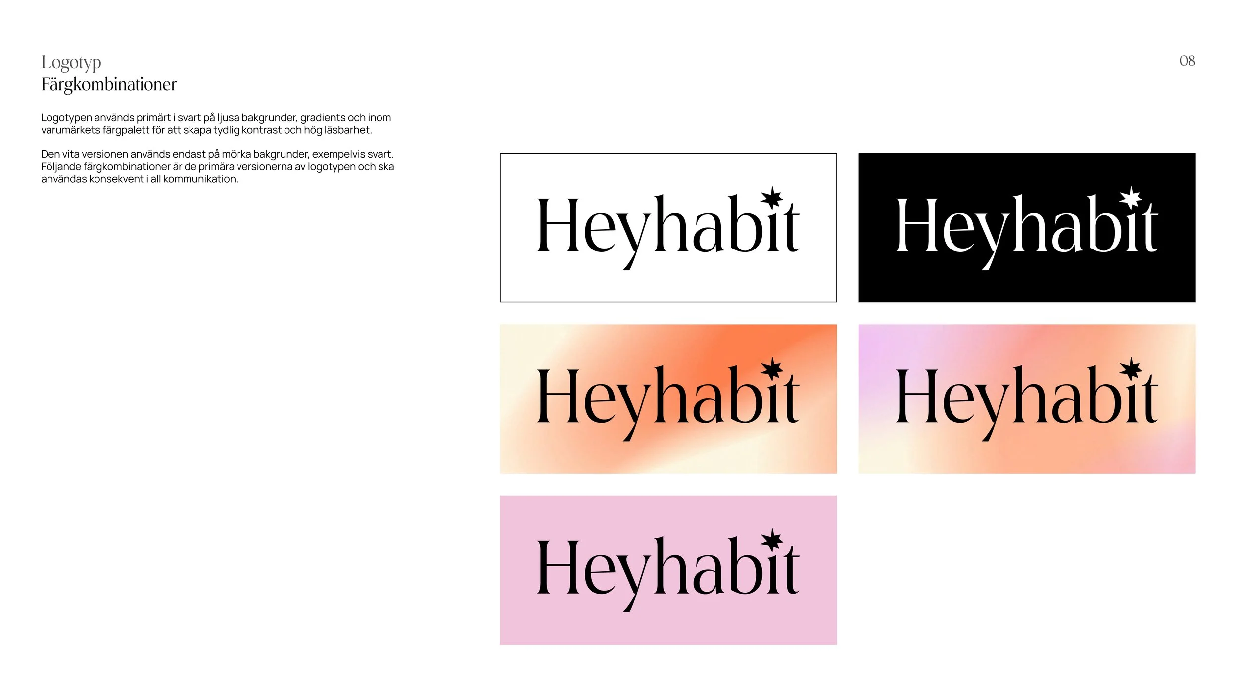
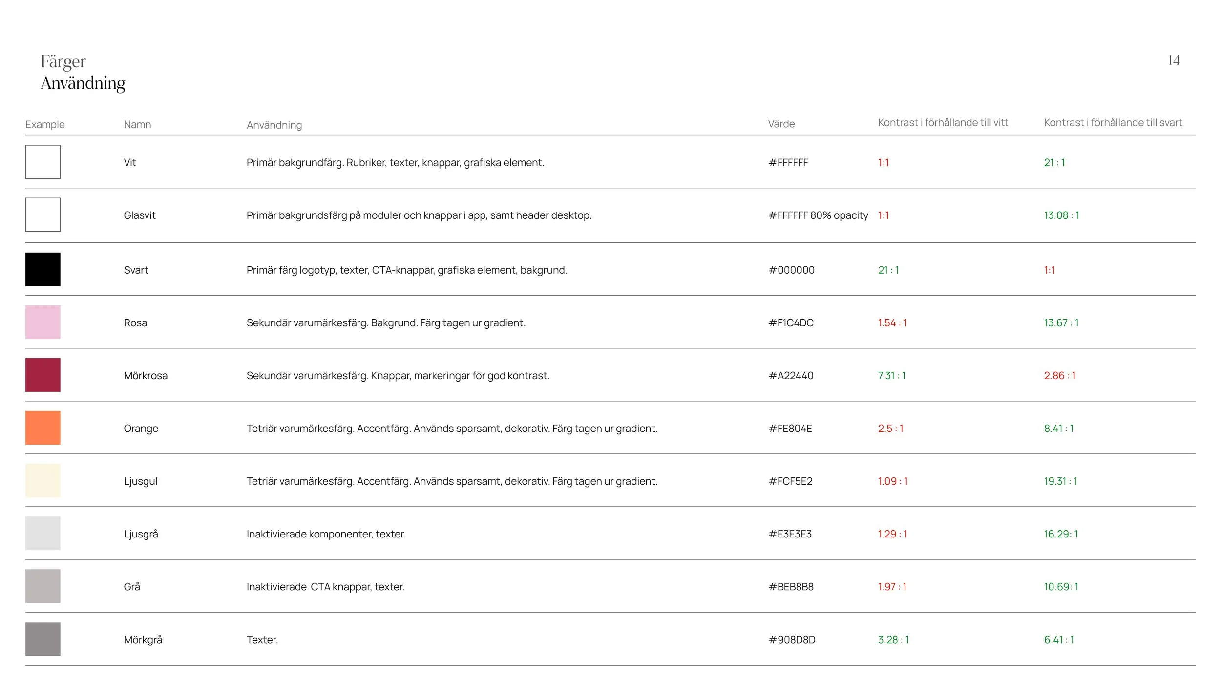
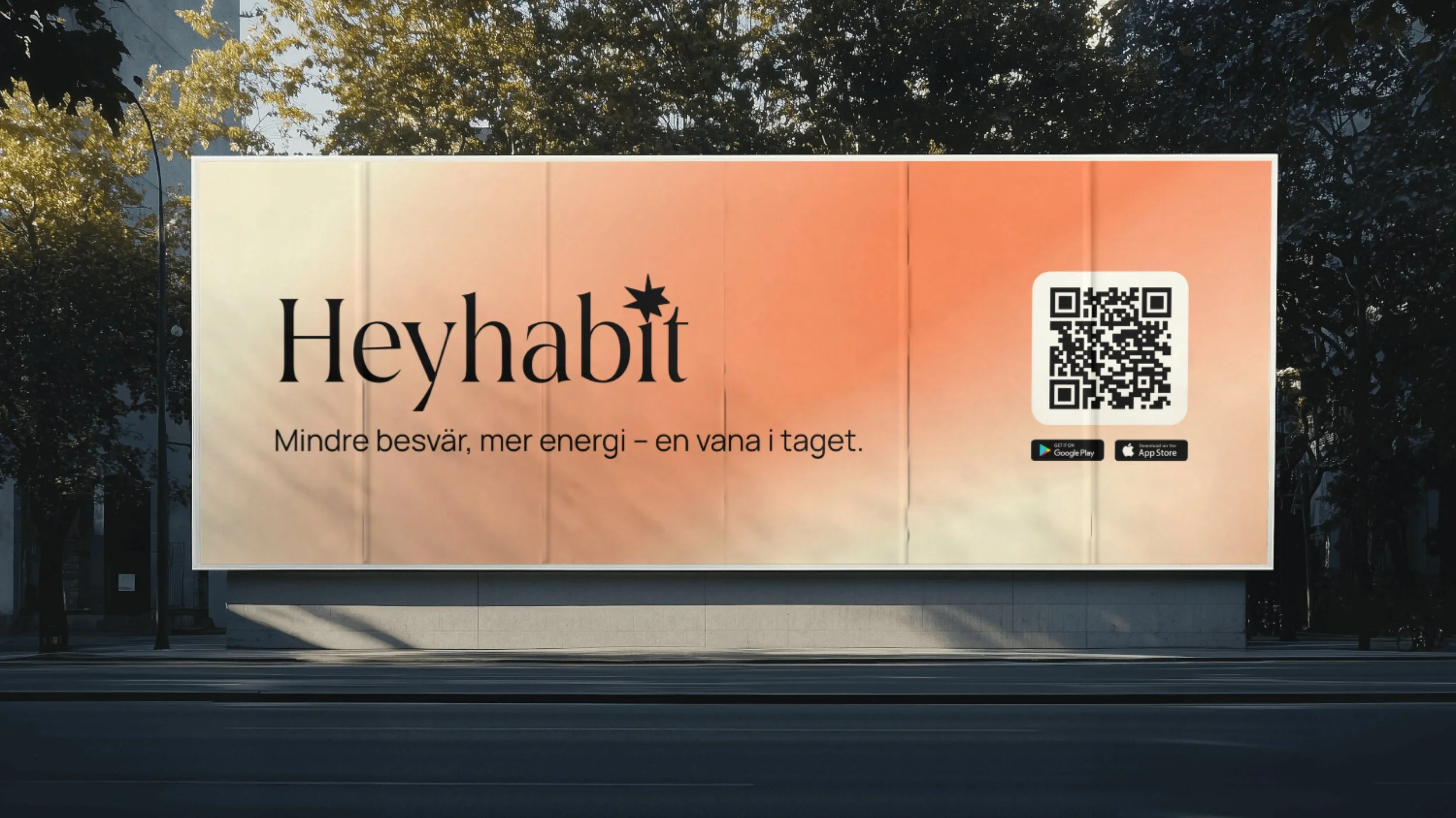
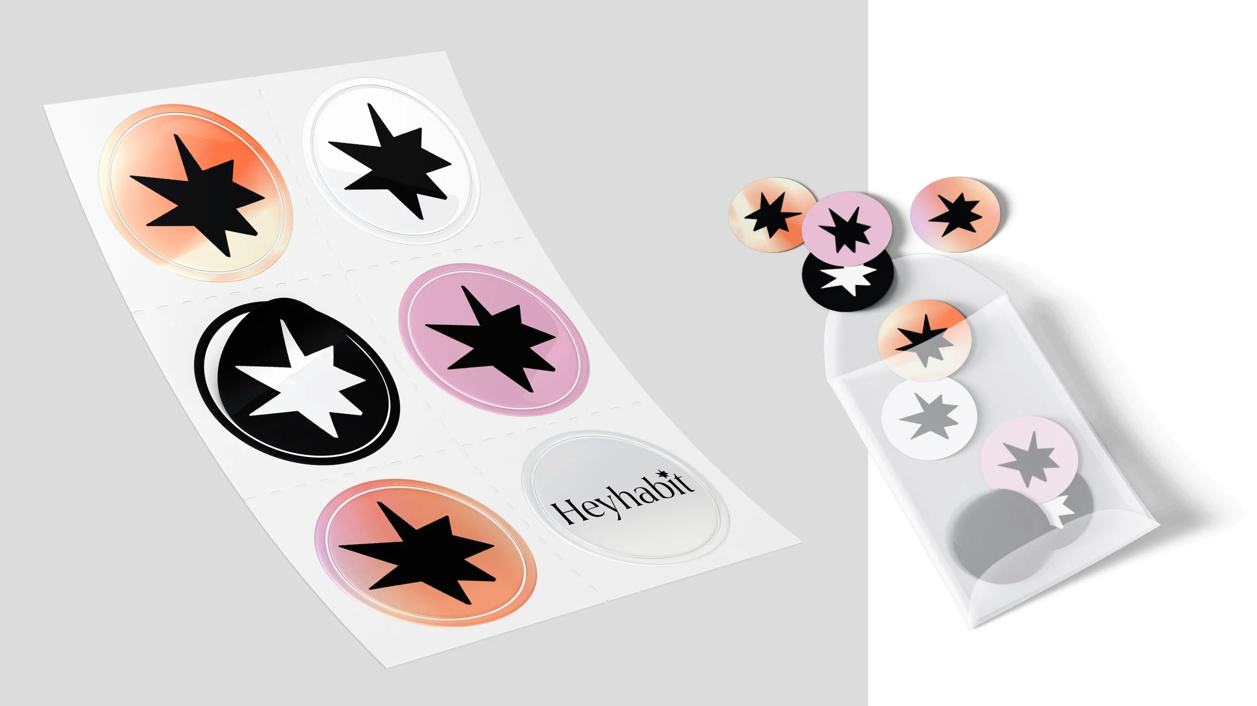
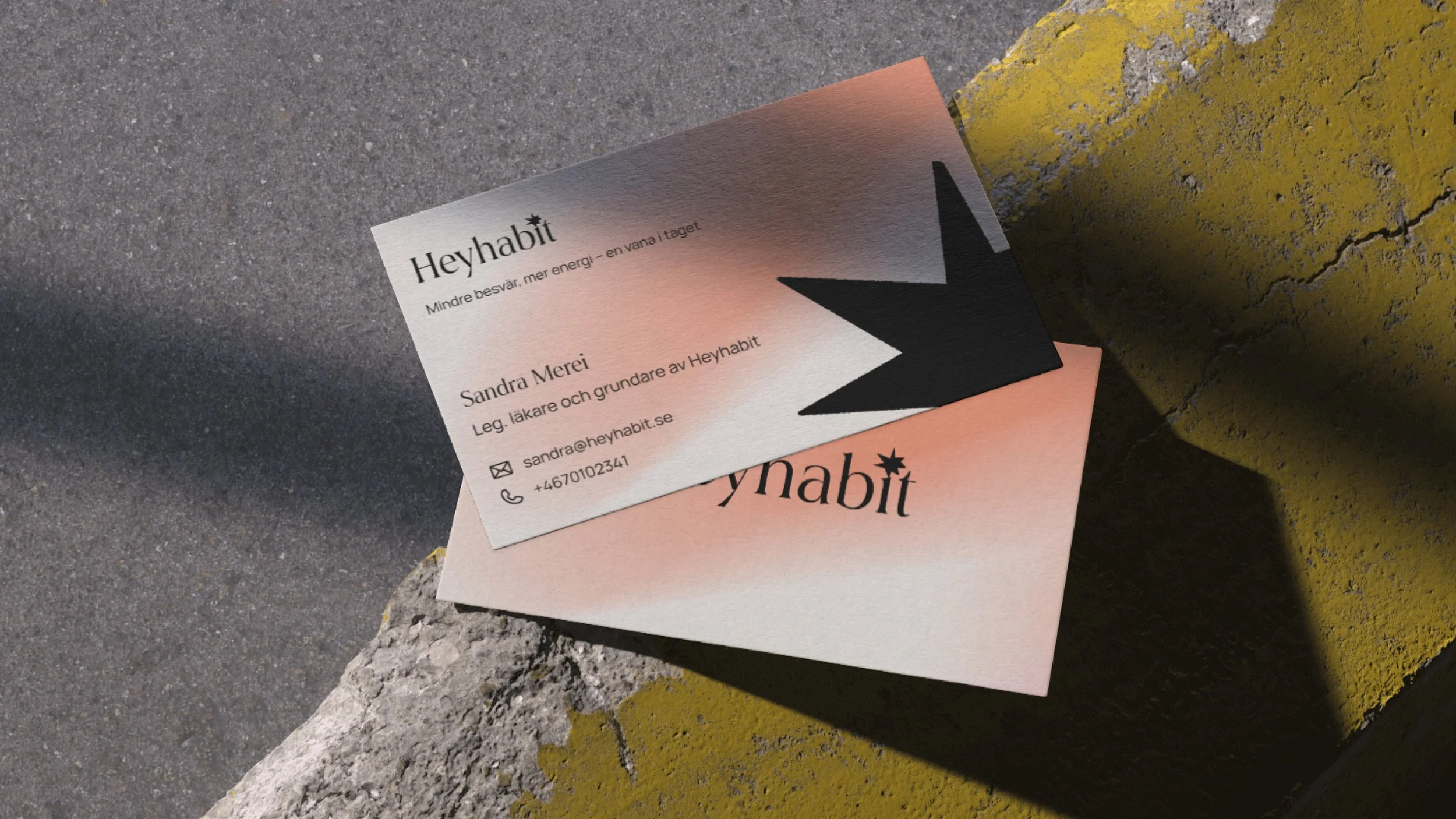
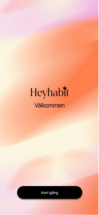
We developed a completely new visual identity inspired by Heyhabit's original color palette, while giving it a distinct character of its own. The pink and orange gradients were hand-painted on an iPad, creating an organic and personal feel. These are paired with black, gray, and white, with the black adding the sense of edge that was previously missing.
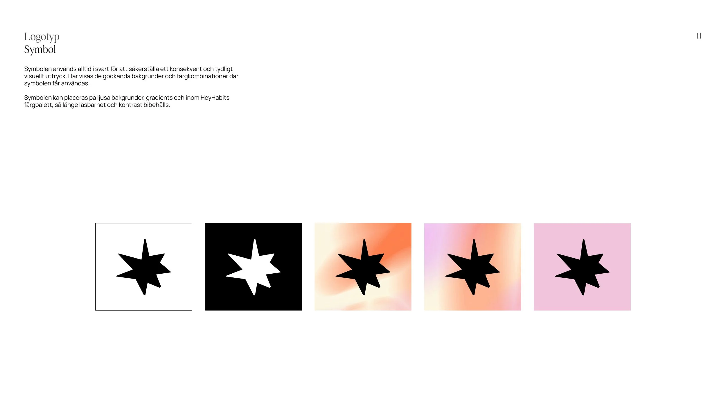
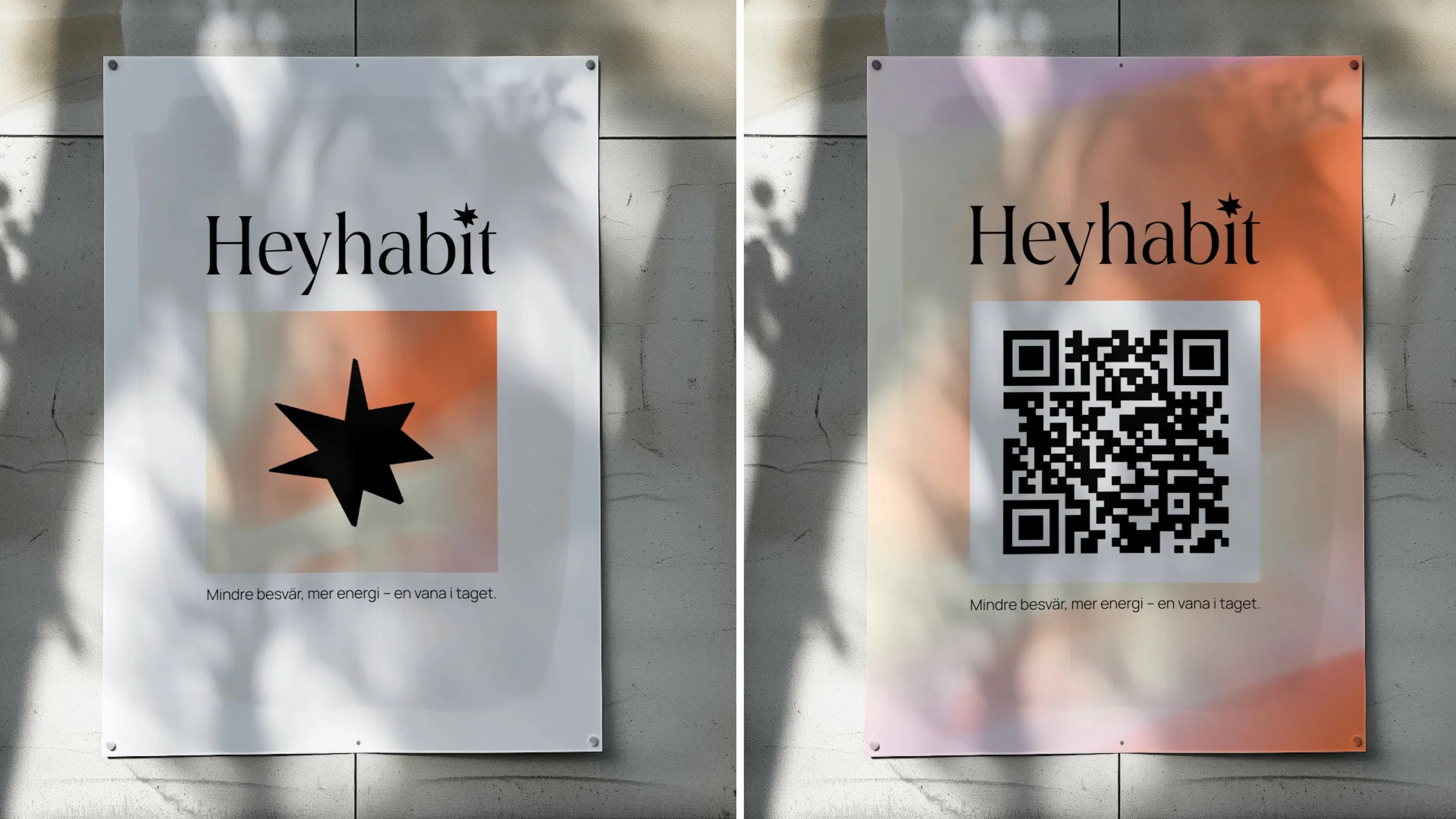
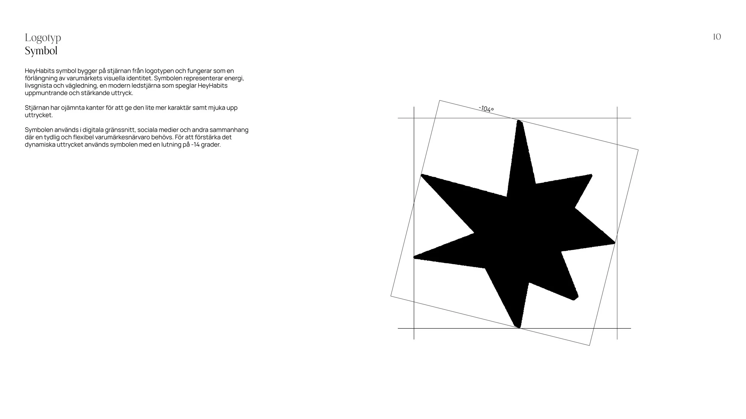
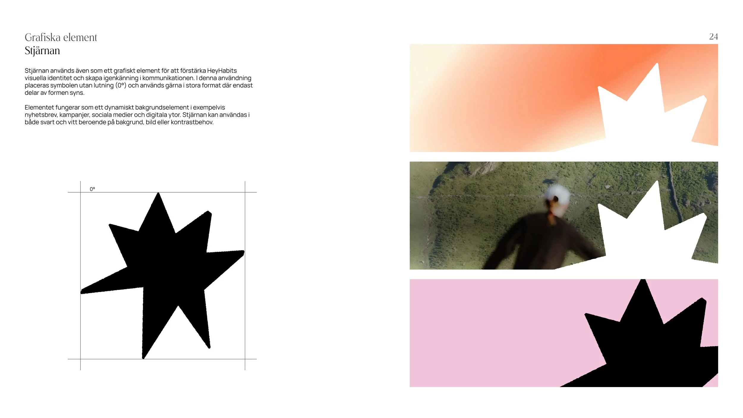
We also refined the logo and introduced a hand-drawn star, symbolizing guidance, ambition, and direction. A glass-effect design language is used throughout the brand to create a modern and airy aesthetic.


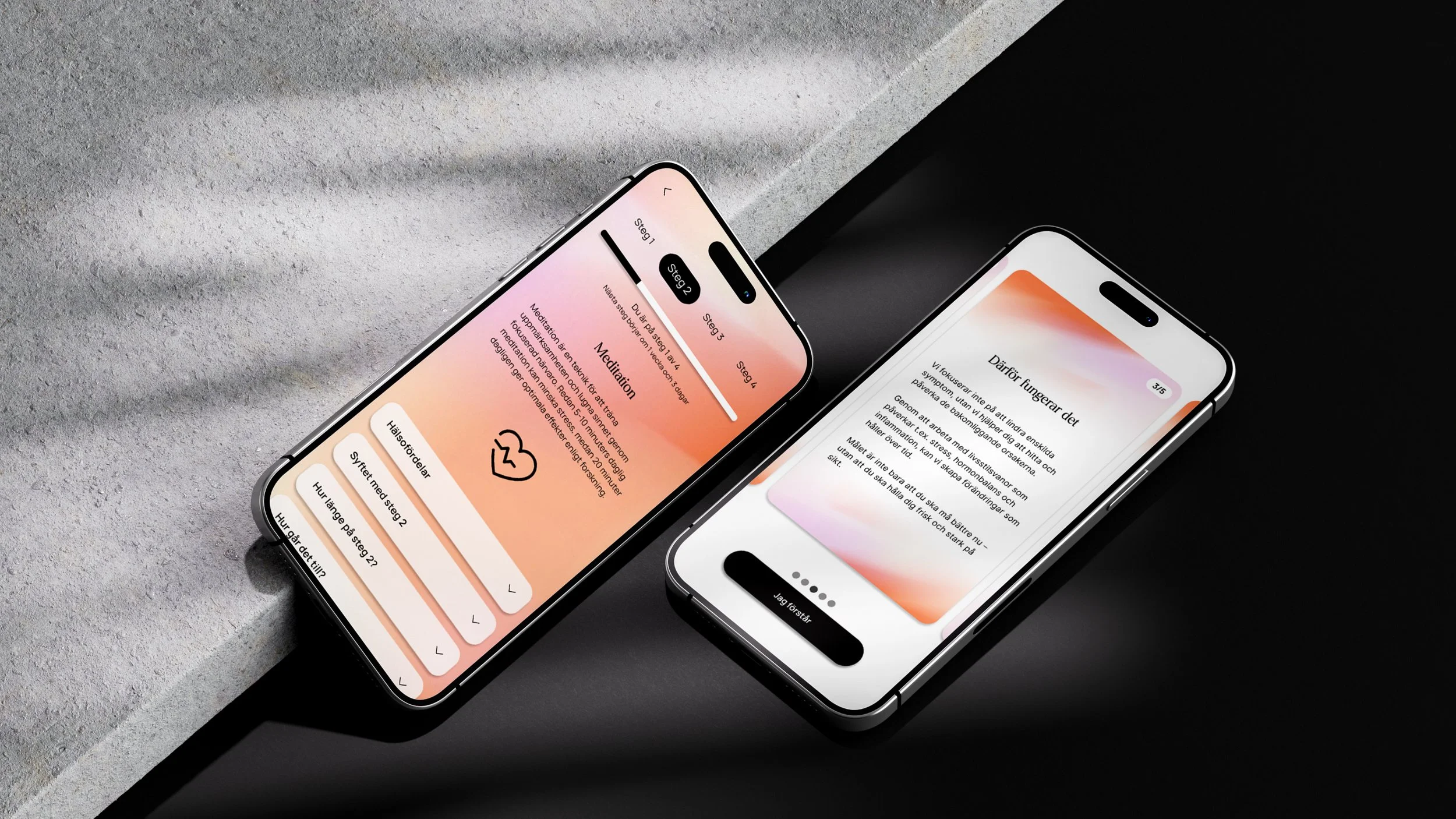
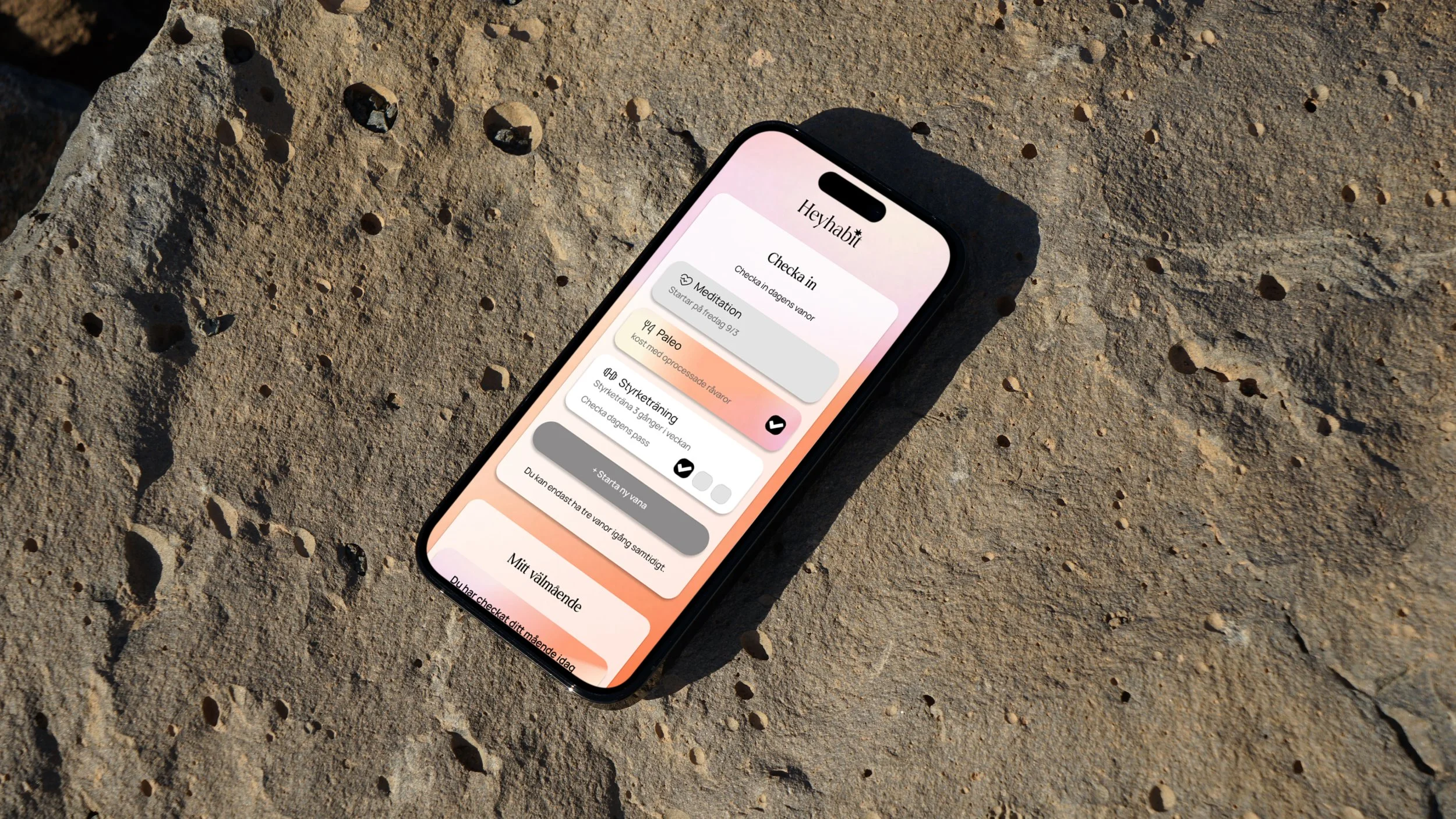
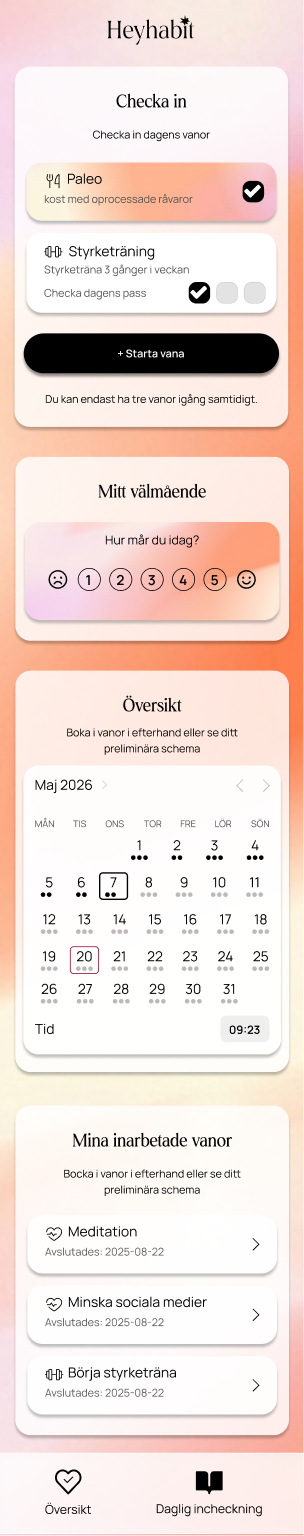
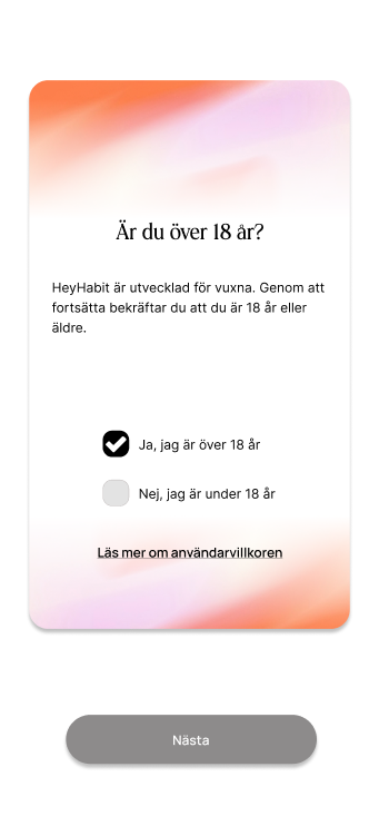
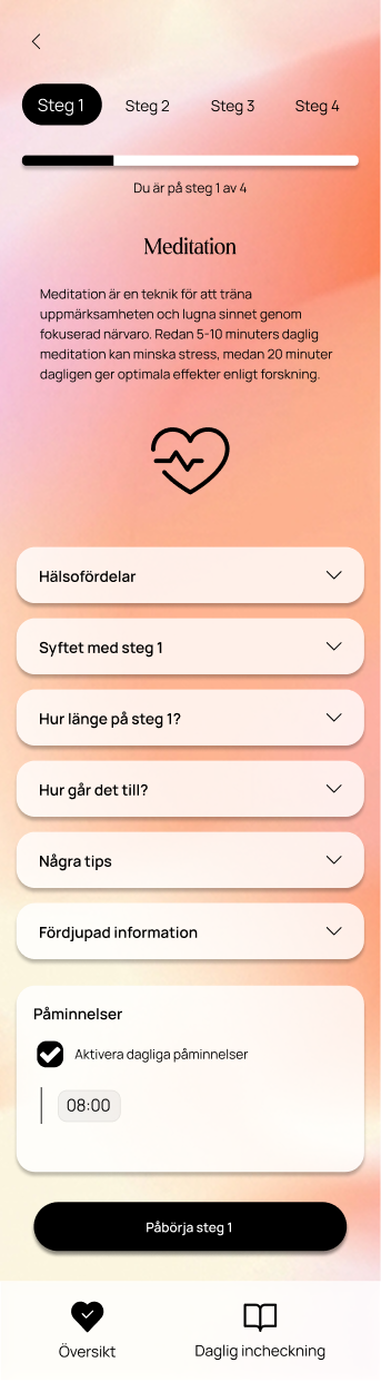
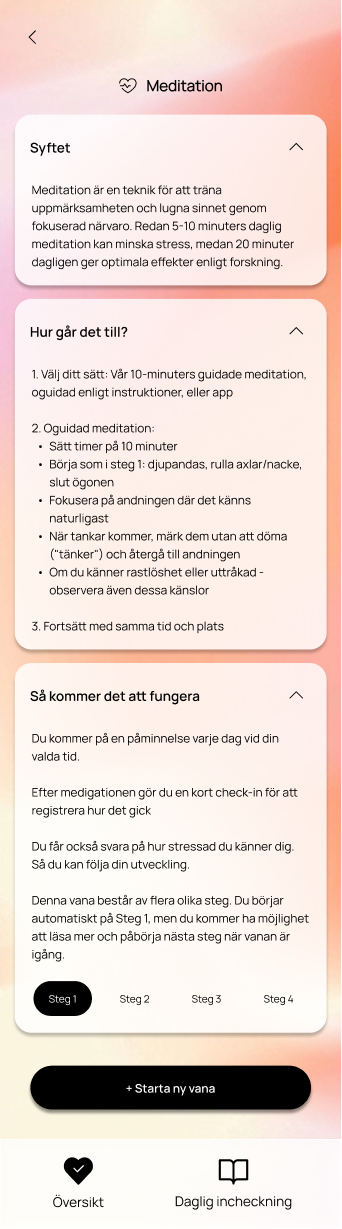
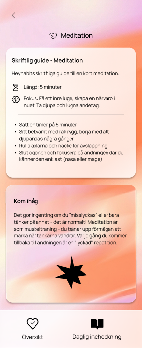
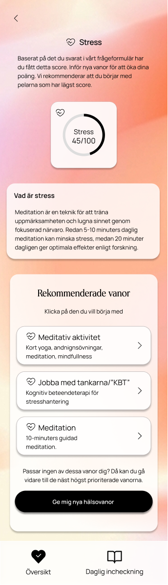
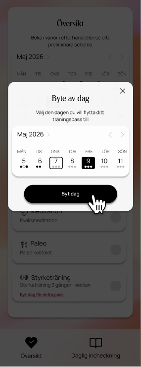
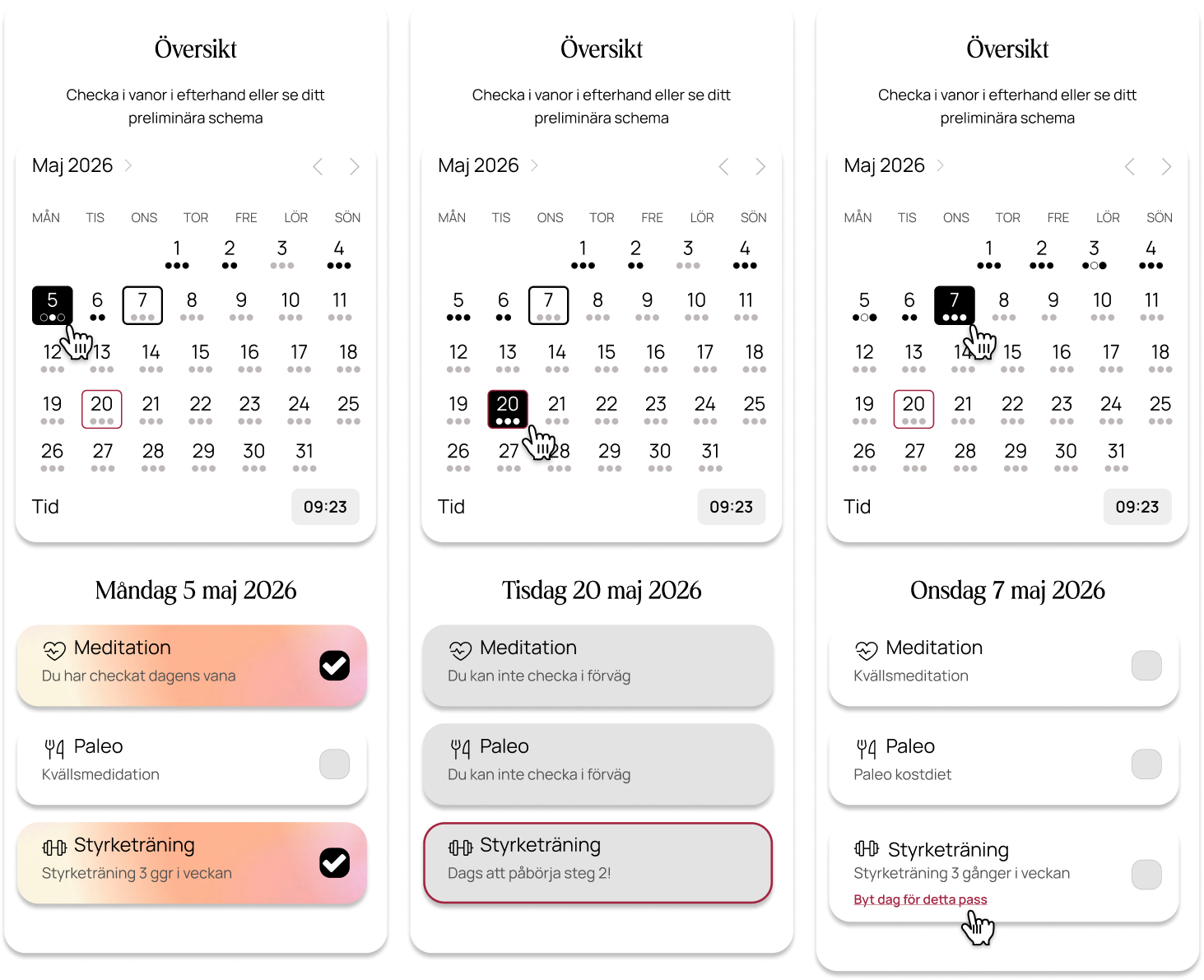
The App
We redesigned every user flow in the app and built the entire design system in Figma using components, variables, and shared styles. This structure allows changes to be propagated across the entire design instantly, while also creating a smoother handoff process for frontend development.
A selection of individual screens is shown in this portfolio to give an impression of the visual design and interface. The full set of flows is documented in the thesis project but has been omitted here for brevity.


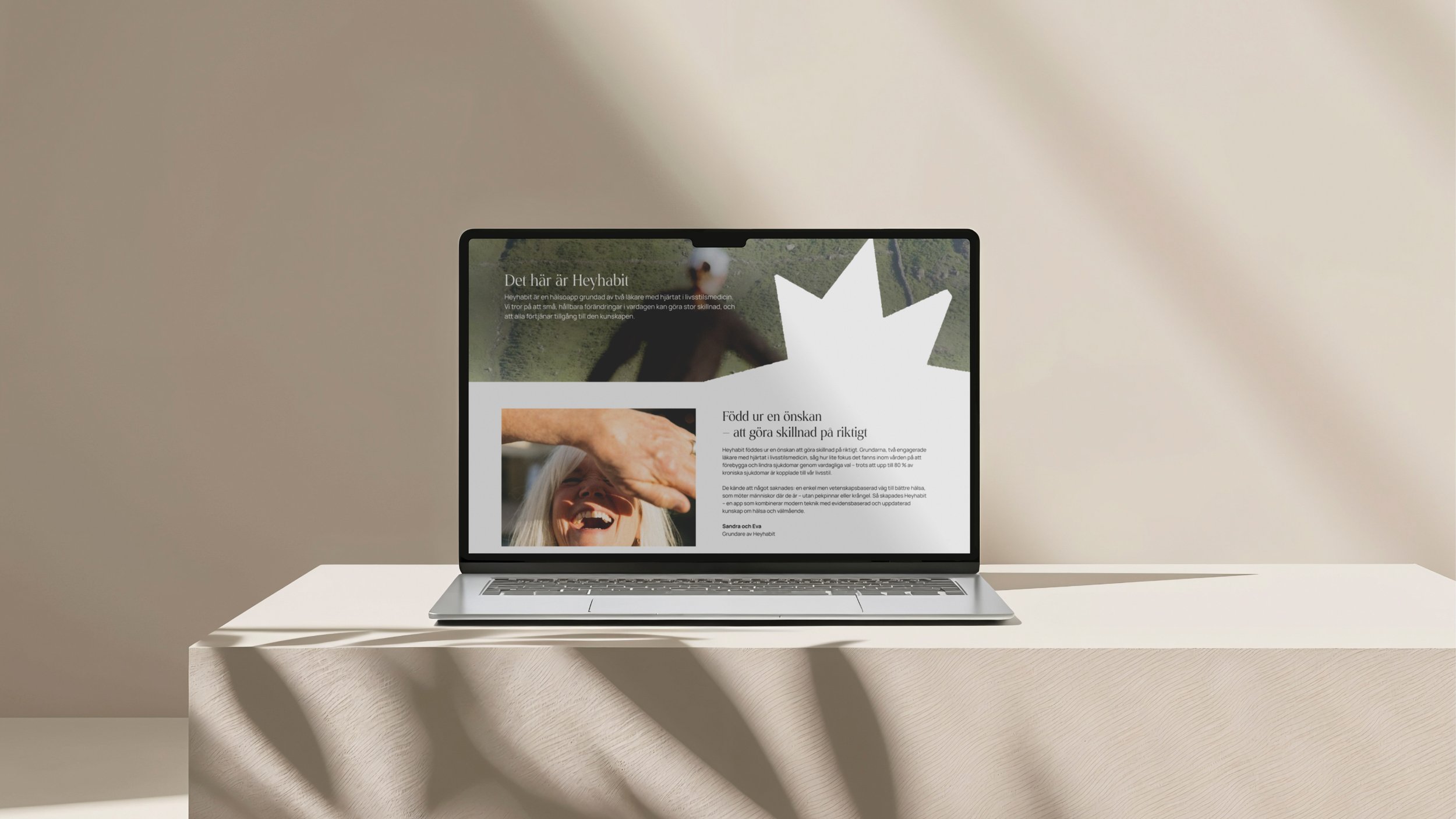
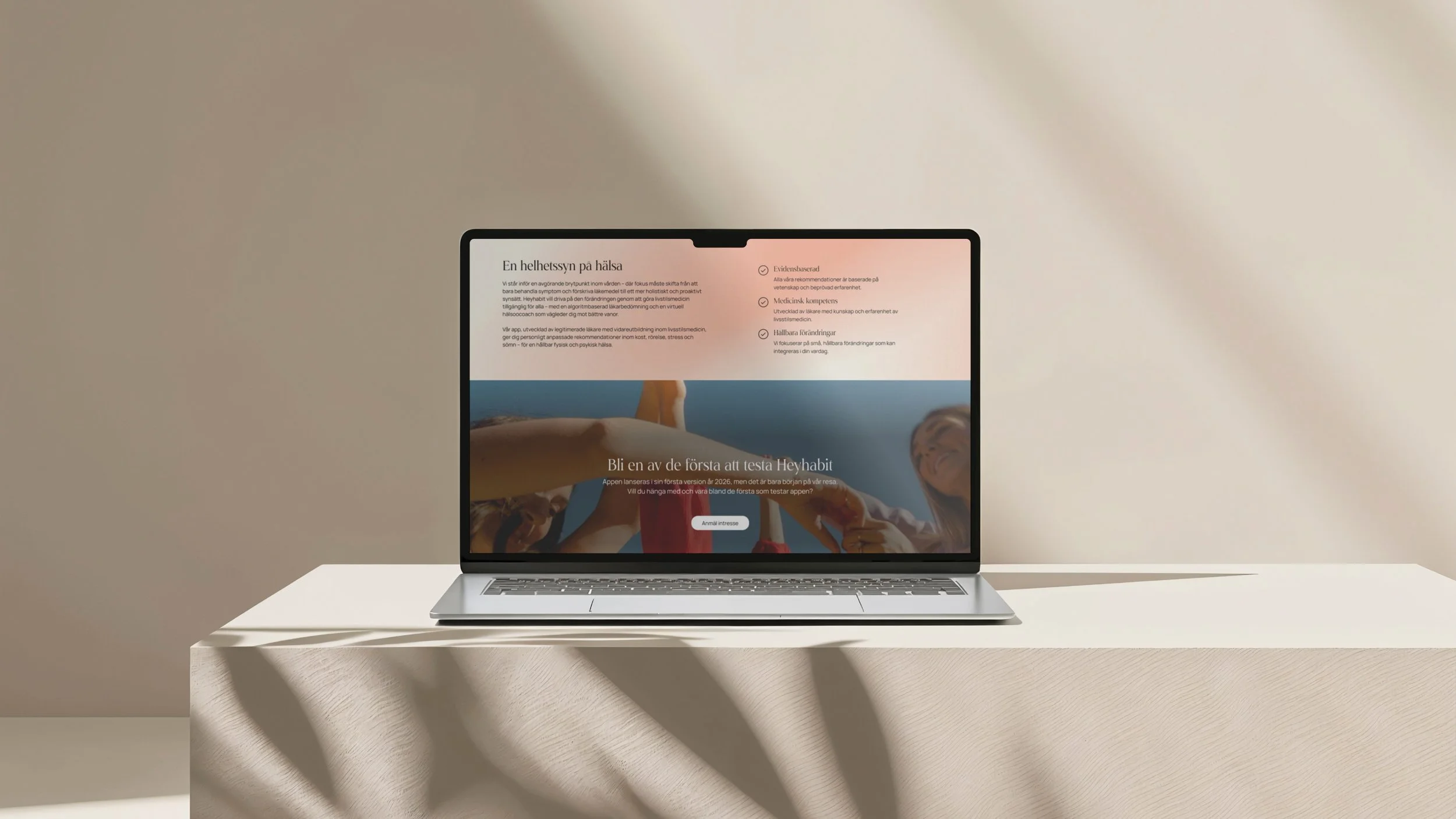
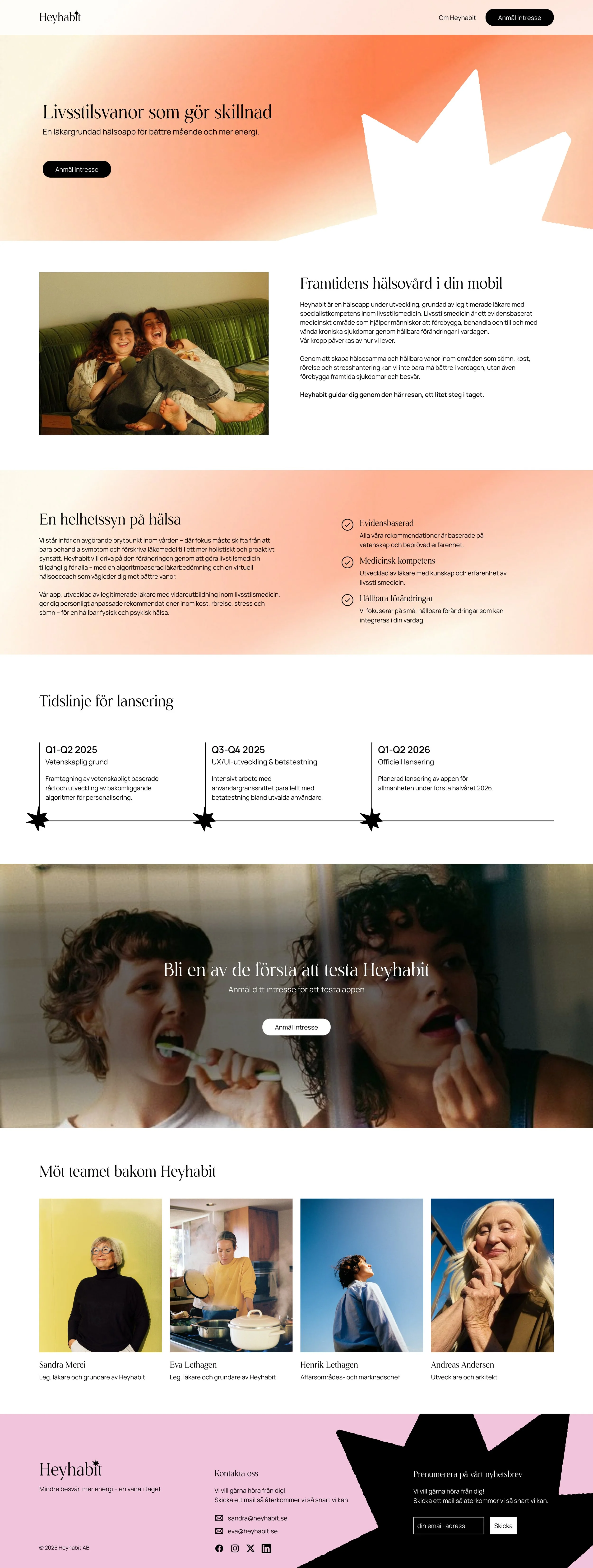
The Website
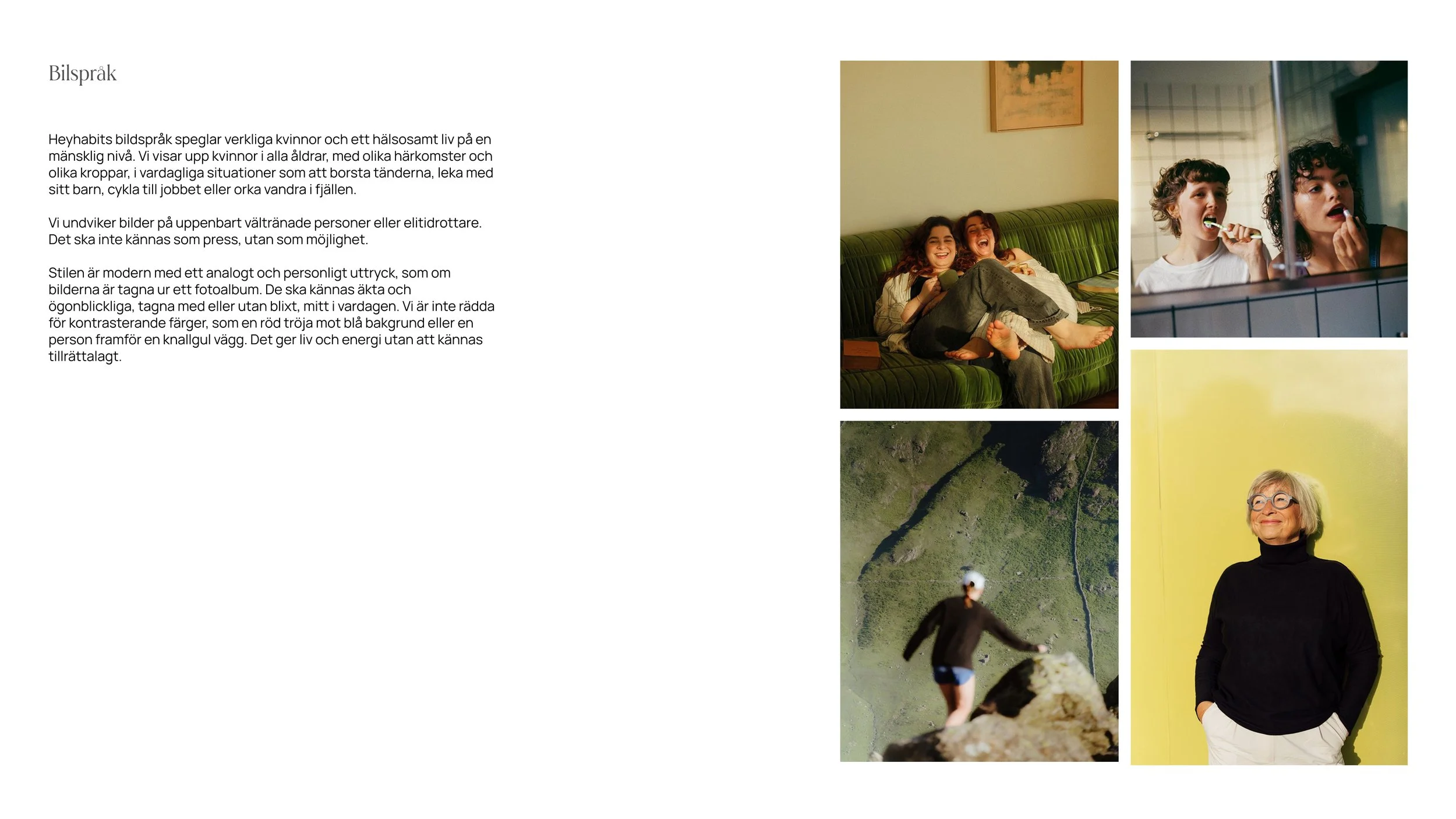
I distilled the website down to the information visitors are actually looking for when they discover Heyhabit and structured the experience around those needs. The content is presented in a spacious and easy-to-scan layout that feels both inspiring and accessible.
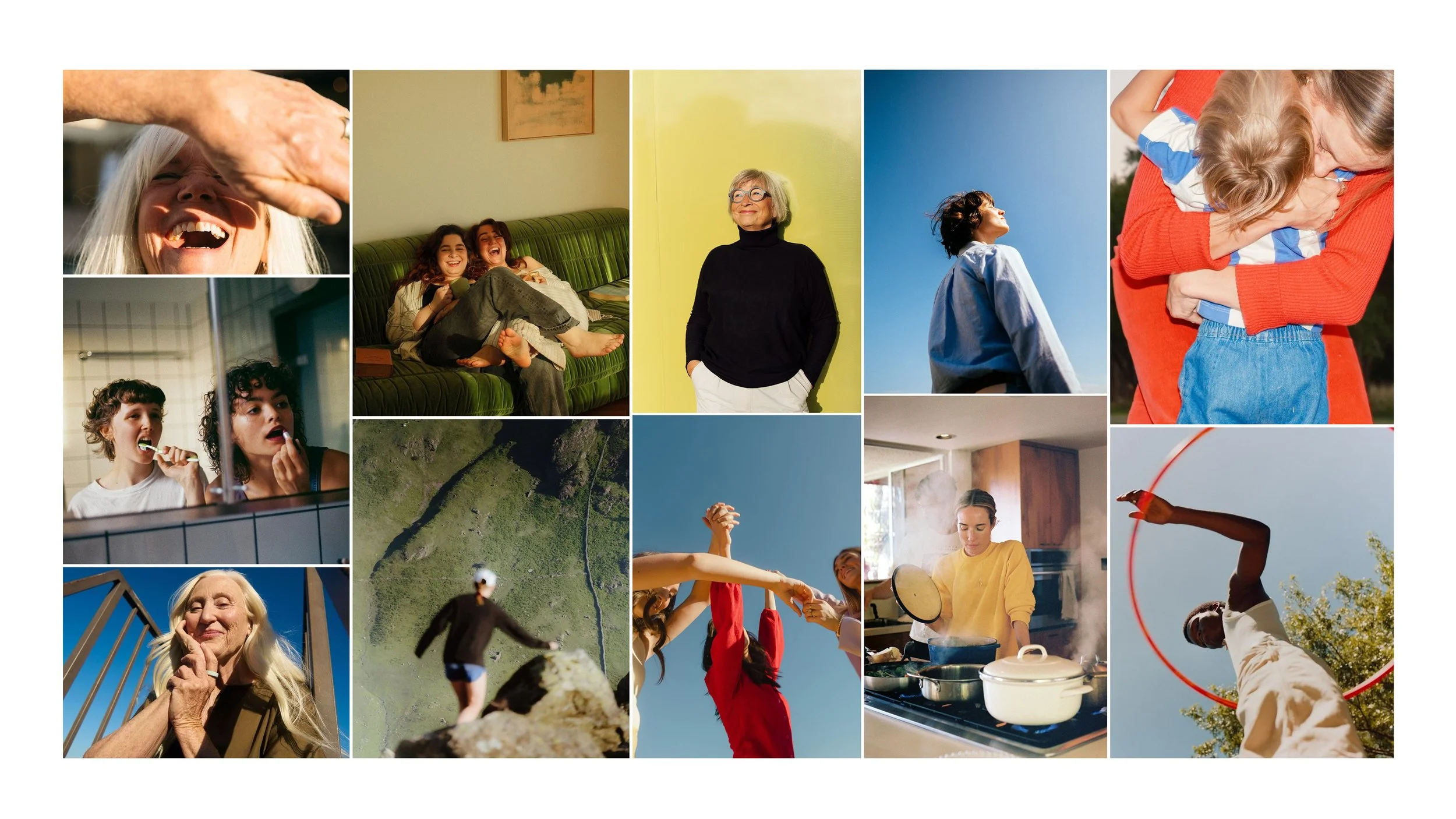
The hand-drawn star appears throughout as a recurring visual element, while the imagery reflects the tone and personality of the new brand identity.


Course Leader's Feedback
"You have produced one of the most thorough and strongest thesis projects in the class. You managed a real-world project with a real client and delivered a complete MVP design, design system, website, and beta study with real users. The connection between research, insights, and design decisions is consistently strong, and the discussion section is among the best I have seen. Extremely well done!"
"The presentation was highly professional throughout. Great red thread! Your collaboration was a particular strength—it was clear that you listened to one another and supported each other's presentations."